KEEP IN TOUCH
Subscribe to our mailing list to get free tips on Data Protection and Cybersecurity updates weekly!


Microsoft recently announced its Windows event for June 24 and the company has been slowly dropping hints in teasers that suggest Windows 11 or next-gen OS is around the corner.
The company also uploaded 11 minutes long relaxing music video on YouTube, which shows off sunlight passing through the company’s logo to form the number ’11’ on the ground.
Windows 11 preview build recently leaked online, confirming the speculation and reports that the next generation of Windows is called “Windows 11”. Thanks to the leaked build, we know pretty much everything about Windows 11.
Unlike Windows 10 or Windows 8, Windows 11 comes with centered Start Menu and taskbar, similar to ChromeOS.
Start Menu doesn’t come with traditional live tiles. It comes with a new interface that uses static icons for Microsoft Store apps, Microsoft Edge-powered Progressive Web Apps and other programs, similar to Windows 10X and Chrome.
Also Read: The 5 Phases of Penetration Testing You Should Know
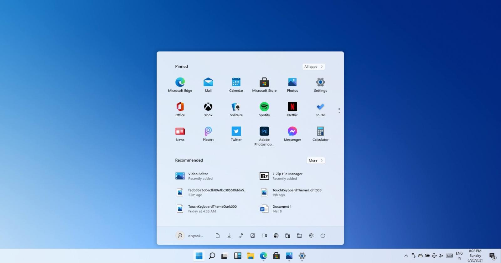
By default, the Start Menu will include pinned apps and services like Calculator, Microsoft Edge, and Settings. Like Windows 10, Windows 11’s Start Menu will show apps and websites only. However, users won’t be able to group apps to create a folder, a feature that is currently offered on Windows 10’s live tile interface.
You can still right-click on any icon to access the app’s settings and pin it to the taskbar.
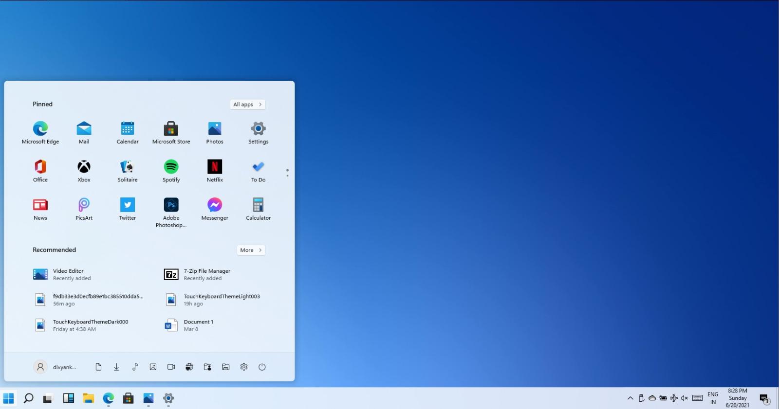
You can always restore the left-aligned taskbar and switch between three different sizes – small, medium and large. The small size is aimed at desktops with mouse support and medium or large size appears to be very touch-friendly.
At the moment, users need to modify their Registry to change the size of the taskbar. It’s likely that taskbar customization options will be offered via Windows Settings to switch between different sizes of Windows taskbar.
.jpg)
The same modern Settings app is offered, which can be used to customize Start Menu with additional shortcuts. You can also use it to customize the Action Center, desktop wallpaper, system accent, and enable transparency effect for the taskbar, and more.
Some Windows features are now maintained outside the usual Windows updates using experience packs.
Windows 11 looks a lot like Windows 10 and it is essentially a Windows 10X shell for Windows 10. Microsoft has introduced new colorful icons, rounded corners, and new animations.
Fortunately, if you don’t like modern alternatives, legacy features are still included on Windows 11.
Users can launch and operate Control Panel, Device Manager, Disk Management and all other legacy tools. Microsoft is not modernizing the interface of these legacy features and components, but there’s one visible change – Microsoft has enabled rounded corners and shadow effects.
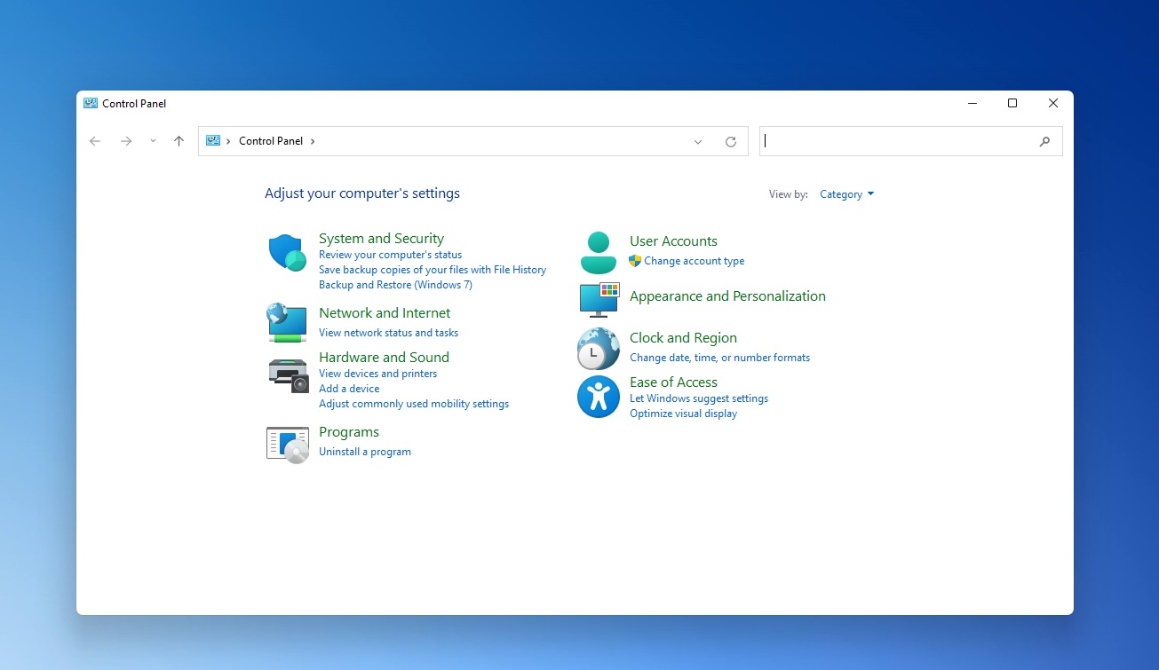
Icons within the Control Panel and other pages have been revamped with a touch of Microsoft’s modern Fluent Design.
Microsoft seems to be replacing sharp edges with rounded corners almost everywhere, as shown in the below screenshot of Device Manager.
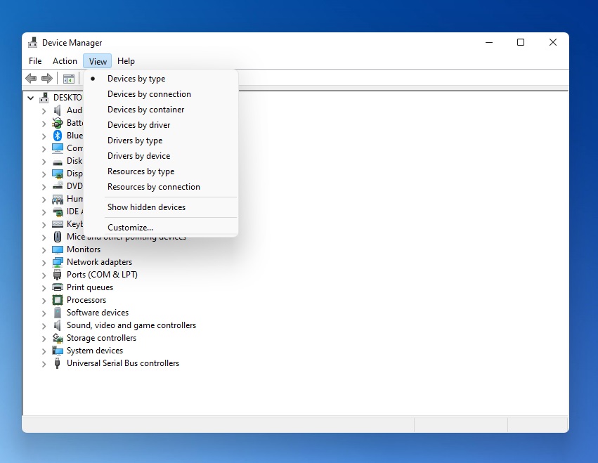
These changes are not huge, but proper implementation of rounded corners is necessary to maintain consistency across the platform.
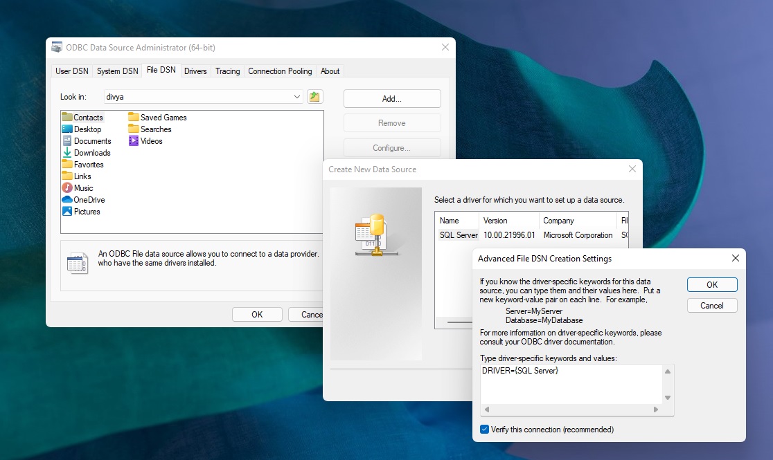
In our tests, we also observed rounded corner and shadow effects in ODBC Data Source Administrator, which is one of the oldest legacy parts of Windows and was first introduced in Windows 3.1-era.
Remember that this is a leaked build and Microsoft is still working on Windows 11, which is going to look and work better than the leaked update.
Also Read: Got Hacked? Here Are 5 Ways to Handle Data Breaches
Windows 11 will bring new icons, rounded corners, and dark mode improvements to File Explorer.
.jpg)
As you can see in the above screenshot, Microsoft has improved File Explorer for tablets to help users with touchscreen, so they can easily interact with files without switching to tablet mode.
File Explorer has been updated with better consistency, so you can expect a new context menu with rounded corners.